Cover lines are used to let the reader know what extra content will be in the magazine and encourage them to buy it, these are the ones I might use:
All nighters, Strippers
& Hotel Rooms
with...
ASH RIDER!
Ella Jett
Reveals all!
Cyndi Tyler
She’s back and she’s edgier than ever!
TICKET GIVE AWAY TO THE BEST ROCK FESTIVALS!
Wednesday, 5 February 2014


Tuesday, 4 February 2014
CD image to use on double page spread
To make my music magazine appear more professional I have created an album cover that will be put on my contents page to feature some of the work by the artist I am covering.

I chose this photo as it is a long shot and it has interesting scenery, these factors are important when creating an album cover as they have to be visually pleasing and eyecatching at the same time.

To edit this photo I lowered the exposure so it had more of a dark gritty appearance, I also added the Vignette filter which darkened the edges of the image.
I used the font "DOWN COME" for the artist name and the font "Typewriter" for the name of the artist as they were both edgy and suited the genre of my magazine. The fonts used on my album cover match the mise-en-scene of the other photos in my magazine and suit the rocky theme of my magazine.
I added the "Parental Advisory Explicit Content" sticker on the corner of the magazine as I have seen it on lots of album covers and I have found that it appears very often on lots of rock themed album covers specifically.
Monday, 3 February 2014
Second photo shoot
This time for my photo shoot I went out early in the morning so that there was better light, I went to the same woods but this time I went to an area where there are crumbling remains of old buildings. I chose this location as it looks rocky and edgy and suited the theme of my magazine. It also made the photos more interesting and looked like they were more suitable for a front page picture. I went for a slightly different styling approach this time I used much darker colours and focused more on the "emo" theme rather than just the edgy look that I used in my first photo shoot.

In this image the reader can see more of the model as a long shot is used therefore this image would be good for either the contents page or smaller photos that feature on the double page spread as the reader gets to see and understand a bit more of the act.

 These two images are both similar and they could both be used as cover photos as they are engaging and interesting for the audience therefore they will be encouraged to buy it over othe music magazines.

This landscape mid shot photo would be good to use as a sub focus image on the double page spread.

This image may be used as a front cover image as it is a mid shot and the model is making eye contact however I think there are images that would look better.

I think that this photo would be more suitable to use as a frontpage image as it is a close up shot therefore the model has engaging eye contact with the audience, which would catch the readers eye and encourage them to buy the magazine.
 This photo is different to all of my others so I think it is interesting enough to use as the main feature image on my double page spread, it is a long shot so the reader gets to see more of the artist and the scenery and composition makes for an attractive and interesting image.
To continue with the rocky theme my model was wearing black leather trousers, a brown leather jacket, statement necklace, gold studded grey top and brown leather military styled boots.This created a rocky feel to the pictures that you would expect to see in a rock magazine therefor the audience/reader will be aware of what type of magazine it is.
In this image the reader can see more of the model as a long shot is used therefore this image would be good for either the contents page or smaller photos that feature on the double page spread as the reader gets to see and understand a bit more of the act.
This landscape mid shot photo would be good to use as a sub focus image on the double page spread.
This image may be used as a front cover image as it is a mid shot and the model is making eye contact however I think there are images that would look better.
I think that this photo would be more suitable to use as a frontpage image as it is a close up shot therefore the model has engaging eye contact with the audience, which would catch the readers eye and encourage them to buy the magazine.
To continue with the rocky theme my model was wearing black leather trousers, a brown leather jacket, statement necklace, gold studded grey top and brown leather military styled boots.This created a rocky feel to the pictures that you would expect to see in a rock magazine therefor the audience/reader will be aware of what type of magazine it is.
First photo shoot
Following from my mise-en-scene research I went on a photo shoot in the woods near my house using my friend Annabel as my model. I chose the woods as the location for my photo shoot as I thought it would mkae the photos more interesting rather than just having a blank wall, I think photo shoots that happen on location also look more proffessional and I need that for the production of my magazine.
For preparation I looked at photos in rock magazines like Kerrang and took note of what the models looked like, when styling my model I used dark smoky colours for the make-up, I also curled the models hair and back combed it so that the model looked rocky and edgy and suited my magazine.
To make sure my magazine is recognised as a rock magazine my model was wearing black skinny jeans, leather jacket, statement necklace and studded back boots. This definitely created a rocky feel to the pictures and promoted the genre of the magazine.


I think that I could use either of these photos on my contents page to fill up space and have different images on the page so it looks more interesting and proffesional.
For my next photo shoot I will go out earlier in the day because I was limited to the amount of photos I could take due to the lack of light.
For preparation I looked at photos in rock magazines like Kerrang and took note of what the models looked like, when styling my model I used dark smoky colours for the make-up, I also curled the models hair and back combed it so that the model looked rocky and edgy and suited my magazine.
To make sure my magazine is recognised as a rock magazine my model was wearing black skinny jeans, leather jacket, statement necklace and studded back boots. This definitely created a rocky feel to the pictures and promoted the genre of the magazine.
I think that I could use either of these photos on my contents page to fill up space and have different images on the page so it looks more interesting and proffesional.
For my next photo shoot I will go out earlier in the day because I was limited to the amount of photos I could take due to the lack of light.
Saturday, 1 February 2014
Identity/background of artist
The artist that my magaizne will be focused on is going to be called "Cyndi Tyler" I chose this name as it sounds interesting and different, the alternative spelling of the name "Cyndi" also makes the artist sound more edgier and therefore linking to my rock theme.


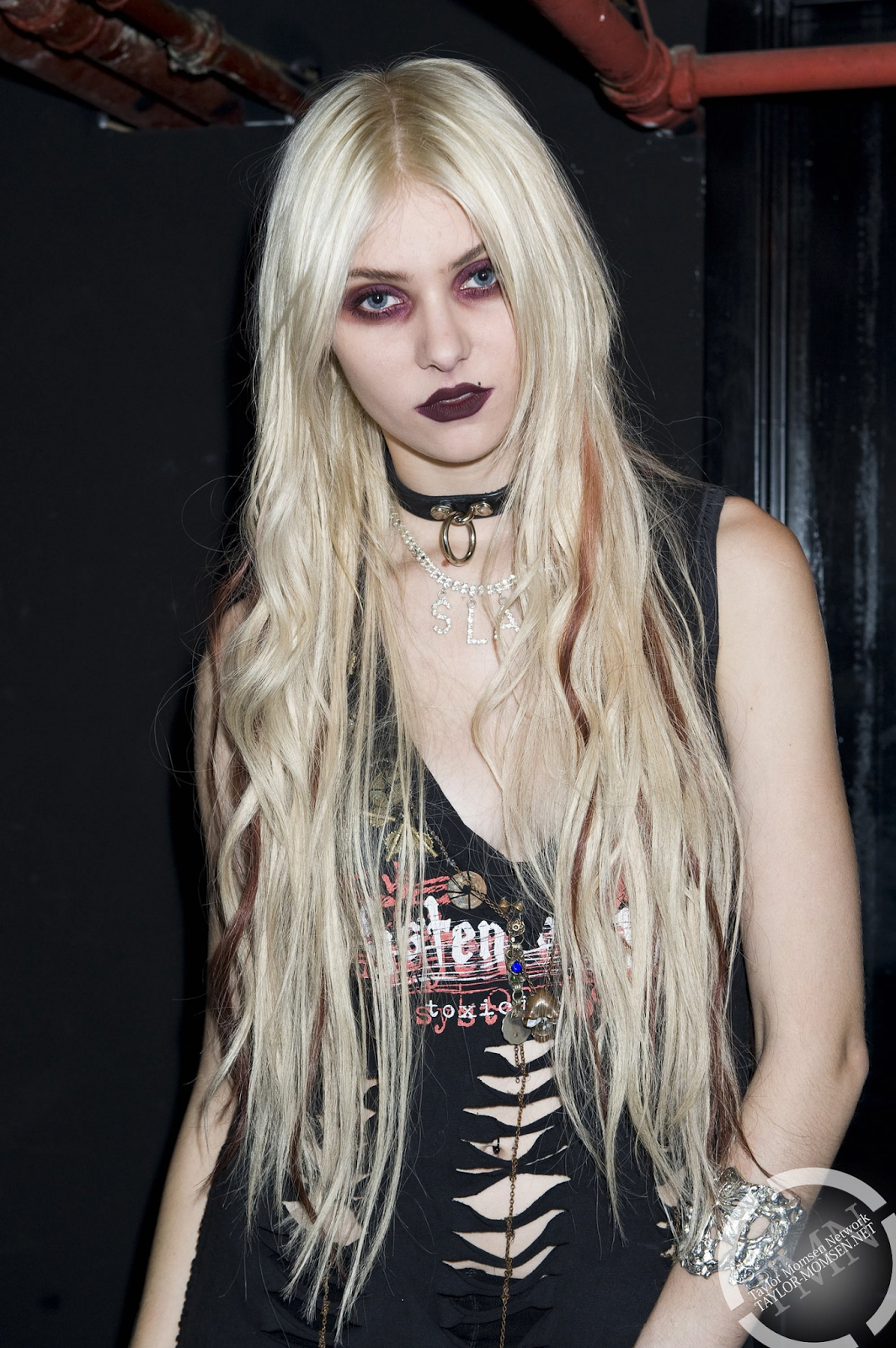
I am going to base the image of my artist on existing female rock artists such as Taylor Momsen, Hayley Williams and Amy lee.
The background story of my feature artist, Is...
Cyndi Tyler the British rock artist that is back from a years break after having a number one album and receiving a Brit award for 'Best Rock Artist'. She is promoting her new Album and tour 'Redemption'.
I am going to base the image of my artist on existing female rock artists such as Taylor Momsen, Hayley Williams and Amy lee.
The background story of my feature artist, Is...
Cyndi Tyler the British rock artist that is back from a years break after having a number one album and receiving a Brit award for 'Best Rock Artist'. She is promoting her new Album and tour 'Redemption'.
Subscribe to:
Posts (Atom)