This is my pitch explaining why I would like to create a rock themed music magazine called "Hendix". From previous research I have found that there is a gap in the market for a rock magazine to cateer for males and females aged 16-20.
Research has told me that my magazine should come out at monthly intervals, this is suitable timing as it is frequent enough to keep the audience interested in the magazine but isnt too often that the audience can not keep up with the most recent issue.
I would set the price of my magazine at £2.50 - £3 as this is a suitable price for my target audience, if it was too expensive then my young target audience wouldnt be able to afford it.
On the subject of what will be included in my magazine, it will have gig reviews, photo shoots, posters and new music/artists as these catagories were most popular in the research I have analysed.
Saturday, 23 November 2013
Friday, 22 November 2013
Music magazine questionnaire
This was the questionnaire that I gave out to people to help me with my magazine.

These are the results from my questionnaire.

From doing this questionnaire I have found that the target audience for my magazine will be males and females aged 16-20. I have decided that the genre of my magazine will be rock as this was most popular with the people I asked. The questionnaire also told me that people would prefer it if the magazine was to come out at monthly intervals and they would be prepared to pay £2.50 - £3 for the magazine. I have also decided that the content of my magazine will include gig reviews, photo shoots, posters and new music/artists as these were most popular in the questionnaire.
Wednesday, 20 November 2013
Double page spread


I have looked at some double page spreads that are featured in "The Rolling Stones" magazine and I have found that in most cases there is a striking and intriguing image that takes up the majority of one page, they do this to intrigue the reader and to make the article seem more appealing.
I have also noticed that it is important to choose a font that suits the genre of music or the artist for example; Florence Welch is an alternative musician so an interesting font has been used to match her work whereas Adeles' page has a much more classic font to reflect her simple and elegant genre.
For my own music magazine I like the idea of having a black and white/grey scale theme but then having red statement features either in the image or in the text as I think it works really well in the Lady Gaga and Florence Welch articles.
Contents page analysis
So that I have a better idea of what to include in the contents screen of my music magazine I am going to anaylse the contents scren of Q magazine.

The information is
usually to the right or the left hand side set out in a column with one main
image that relates to a feature alongside it, in the column there is a page
number with the relevant title that is 1 or 2 words which could be the artist’s
name or ambiguous text to intrigue the reader in bold type and often capitals
and then there are sub lines that give more specific detail about what the
articles are about that is usually in a smaller font. There is also page
numbers on the images that anchor to the written contents.
Q magazine has kept its
colour scheme consistent and relevant with the use of black, white and red. As I
am planning on doing a rock magazine I may incorporate similar colour scheme.
There are other smaller images around the outside of page to make it more
exciting and interactive with the reader.
At the top of the page
there is the name of the magazine, issue date and subscription and contact
information. Sometimes the editor’s letter appears on the top, left hand side
of page.
Tuesday, 19 November 2013
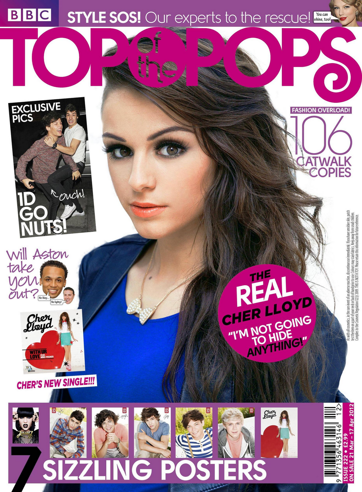
Front cover analysis
I am going to analyse this Kerrang magazine so that I have a better understanding of what codes and conventions I will have to use in my magazine, I chose to use this magazine because I am planning on doing a rock magazine so I feel like this will be most helpful.

The master head is actually behind the image which is unusual but as it is a well-known magazine people already know what it is just from to small bits you can see, it also adds too it’s to cool to care feel which links to its rocky theme. I will need to think about the master head carefully as it gives audience an indication of the content and gives an impression about what kind of magazine it is.
The models on the magazine are the well-known band Fall Out Boy and the lead singer is pointing towards the reader, this entices the audience and makes them feel involved, when taking my photos for my front cover I will need to think about how my image is different and how it engages with the reader. Also in the image the band members are all wearing black and grey clothes, this further explains what type of a magazine it is so that the audience knows what they are buying into.
The magazine also has a pug "Win your birthday printed in the K calendar" these are placed at the top of the magazine as this is the first place the reader looks. It encourages the reader to by the product and makes it seem exciting and exclusive.
The magazine uses secondary images around the outside of the magazine to let the reader know what the rest of the magazine will consist of, it also allows the magazine to appeal to wider audience as they may not like to cover band but still like a band featured in the magazine. These images continue with the rocky feel that the rest of the magazine has to emphasise what genre it is.
The final code I am going to comment on is cover lines. These are extra bits of information around the magazine that tell you about what is insided."10 things you never knew about Metallica" this is another tool used to entice the reader and makes it more likely for the public to buy it.
Monday, 18 November 2013
Front cover investigation


Through at existing magazine genres I have decided that the theme of my magazine will be rock and after looking through different genres of magazines I think I am going to follow the style of the "The Rolling Stones" magazines, I like this style becuause they are edgy and alternative with a retro twist that makes it stand out from the other magazines.
Existing front covers
Here I have looked at a mix of different genre music magazines to help me decide what genre my magazine will be.


Friday, 15 November 2013
Evaluation of School Magazine
Now that I have completely finished my school magazine I have had to to evaluate my performance and my finished product.
What did you find difficult about producing your school magazine? What did you find easy?
I think that the part I struggled with most was actually producing the magazine as I wasn't very familiar with the programme, however I did find the research and analysis very easy and interesting as once I knew all of the terminology I enjoyed identifying which ones were being used in existing school magazines.
What tactics did you use to attract your audience?
I used eye catching colours and fonts and used a variety of photos to make the magazine seem more appealing to the audience. I also used a buzz phrase "Enter our new art competition and WIN BIG PRIZES" to make the magazine more exciting and intriguing to the audience.
What have you learnt about other software's that were used in the production of your preliminary task?
I have become more comfortable working with programmes like photoshop and this will help me with editing the photos that I will use on my music magazine. I am also better at using softwares like fire works, this will also help me when producing my final music magazine.
I have become more comfortable working with programmes like photoshop and this will help me with editing the photos that I will use on my music magazine. I am also better at using softwares like fire works, this will also help me when producing my final music magazine.
What lessons have you learnt here that will enable you to excel in the production of your main task ?
Through doing my preliminary test I have learnt alot more about time managment and that I need to keep on top of my work and stay ahead of deadlines, it has also got me in the habbit of blogging everything I do so that people can see how i have progressed and how I have come to my decisions for my magazine.
Through doing my preliminary test I have learnt alot more about time managment and that I need to keep on top of my work and stay ahead of deadlines, it has also got me in the habbit of blogging everything I do so that people can see how i have progressed and how I have come to my decisions for my magazine.
I feel like I put in a good amountof effort for my magazine and I planned my tasks out in advance to ensure that I didnt fall behind. I am pleased with my final product however I feel that it would have been better if I had more time available and if I was better at working with the programme. My favourite part of my magazine is the school logo, I like the edit I did as it is interesting and it looks very appealing. If I were to do this project again I would spend more time perfecting my skills on the programme In Design so I would produce a better looking final project.
But overall I am pleased with my performance and I would enjoy making a school magazine again.
Thursday, 14 November 2013
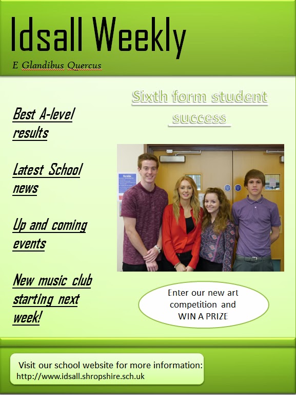
My school magazine
Here is my final cover page and contents page. From my feedback of my draft magazine I have made a few changes such as using more images and a more suitable colour scheme.


Thursday, 7 November 2013
Contents page anaylse
So that I know what I should include in my contents page I have analysed a school magazine that already exists.

From looking at the photo above I have found that my contents page will require a bold eye catching title, relevant photos that link to the text and sub titles that refer to the stories in the magazine with a small decription below that explains what will be in that article.
Editing
For the logo of my school magazine I took a photo of a tree but I found that when i put it on my magazine it didnt look proffesional enough so i decided to manipulate the image to make it more suitable.

First of all I croped the image so it was more of a close up shot and so that the focus was on the tree, I then added the vignette effect to the outside of the image to create a proffesional and more interesting photo. And finally I added the school moto to add to its proffesionalism and I chose the colour white so that it would stand out against the rest of the image.

Wednesday, 6 November 2013
Photo analysis
Here are the photos I took for my school magazine, I based them around the sixth form, using pupils in their lessons.


I wanted to use a photo of students working at a computer to show a differen taspect of the school and a variety of image will make my magazine look more interresting.
Out of the two photos above I think I will use the one on the right becuase it has a wide angle so it makes amore interresting and visually pleasing photo.
I took this photo of Dorian to show a long shot to show that it is in a classroom setting with table and displays in the background. I think I will only use this photo on my contents page to fill up space as it isnt that interresting.

I have taken this mid shot of Izzy and Dorian to give a show a couple of students in the school environmnet I will definitely be using this photo on my contents page as it shows a happy learning environmnet and as the modles are smiling and looking happy it creates an inviting feel to the magazine and makes it more enjoyable to read.

I aslo took a photo of the oak tree to be part of my logo. It will make my magazine look more official, it will be used on both my front cover and my contents screen so that the magazine looks uniformed and smart. I am going to edit this photo to make it look more proffesional.

I will use this photo on my front cover becuase it is eye catching and inviting and it suits the theme and head line as they are focused on the Sixth form. I also like this photos becasue the modles have the same colour scheme so it looks attractive and appealing to the audience.
Front cover draft
This is my plan for my front cover, I have tested this out to see if the font, size, images and colour scheme work well together. Having done this and reviewed my work I thought that my head line wasnt bold and eye catching enough as the wjite text didnt stand out against the pale green background so in my real magazine I will use black text all over so it is easyto read.
I am pleased with the image I have chosen becuase it is eye catching and inviting and it suits the theme and head line being focused on the Sixth form.
I will also use the sme plugs that I have used on my draft as they are relevent and short enough to be intriging to the reader.
Subscribe to:
Posts (Atom)