Here are the photos I took for my school magazine, I based them around the sixth form, using pupils in their lessons.


I wanted to use a photo of students working at a computer to show a differen taspect of the school and a variety of image will make my magazine look more interresting.
Out of the two photos above I think I will use the one on the right becuase it has a wide angle so it makes amore interresting and visually pleasing photo.
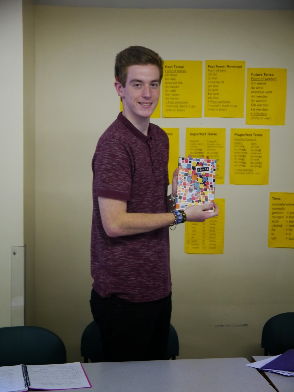
I took this photo of Dorian to show a long shot to show that it is in a classroom setting with table and displays in the background. I think I will only use this photo on my contents page to fill up space as it isnt that interresting.

I have taken this mid shot of Izzy and Dorian to give a show a couple of students in the school environmnet I will definitely be using this photo on my contents page as it shows a happy learning environmnet and as the modles are smiling and looking happy it creates an inviting feel to the magazine and makes it more enjoyable to read.

I aslo took a photo of the oak tree to be part of my logo. It will make my magazine look more official, it will be used on both my front cover and my contents screen so that the magazine looks uniformed and smart. I am going to edit this photo to make it look more proffesional.

I will use this photo on my front cover becuase it is eye catching and inviting and it suits the theme and head line as they are focused on the Sixth form. I also like this photos becasue the modles have the same colour scheme so it looks attractive and appealing to the audience.
No comments:
Post a Comment